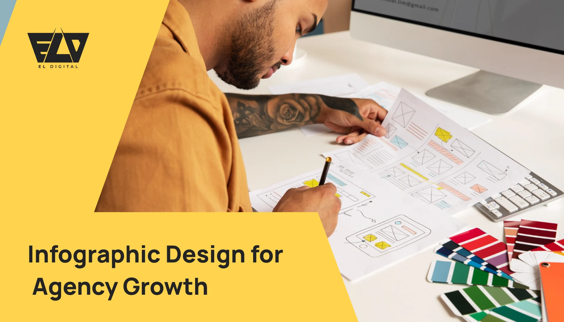
Let’s just be honest: infographics are no longer some cute extra. If you’re running an agency or a consultancy, they are now one of the strongest, most essential tools in your whole arsenal. Why? Because they take complicated, messy information, make it look beautiful and easy, tell a super-fast visual story, and immediately boost your brand’s look.
The attention economy is brutal right now. Face it, a visual will always hit harder and faster than reading some dry, twenty-page report or sitting through an endless slide deck. A killer infographic takes your most difficult, complex data and instantly snaps it into focus—making it clear and impossible to forget. If you want to genuinely cut through all that constant digital noise, these aren’t a luxury item anymore; they are absolutely mandatory.
The attention economy is brutal right now. Face it, a visual will always hit harder and faster than reading some dry, twenty-page report or sitting through an endless slide deck. A killer infographic takes your most difficult, complex data and instantly snaps it into focus—making it clear and impossible to forget. If you want to genuinely cut through all that constant digital noise, these aren’t a luxury item anymore; they are absolutely mandatory.
Here is the no-nonsense guide on how to create infographics that don’t just look nice, but actually drive real business impact.
Here is the point-wise TLDR for the article, focused on the key actions and benefits:
TL;DR
- Stop Reading, Start Watching: Video isn’t a “nice-to-have”; it’s the mandatory core of all marketing now.
- Huge Payoff: It instantly grabs attention and can easily boost your conversion rates by 80%. Serious ROI.
- Work Smart: Create one killer video, then chop it up into smaller clips for everything (social, ads, etc.). Super efficient.
- The Dream Team:
- Musk Deer handles the boring, complex stuff: Flawless tech and video optimization.
- EL-Digital handles the creative gold: Authentic stories and emotional connection.
- The Final Word: If you want to win, you have to nail both the human story and the technical delivery. Go video now.
Why You Need to Be Using Infographics Right Now
The main reason is communication efficiency. Stop forcing your clients or prospects to struggle through massive data dumps. Just show them the conclusion at a glance.
Here’s the simple truth:
- They Pop: Visually, they command attention where text just fades away.
- They Simplify: Even the hairiest ideas suddenly feel totally intuitive and manageable.
- They Fly: They are built for quick sharing on social media and newsletters.
- They Stick: People recall visual information way, way longer than plain words.
Whether you’re presenting client results, explaining your complex new methodology, or sharing proprietary research insights, infographics give you a clear, professional, and beautiful way to deliver the goods.
Your Step-by-Step Guide to Designing for Impact
Forget just throwing some icons and bright colors on a page. Building an impact-driven infographic is all about balancing clarity, narrative, and strategic flow. You must know your audience first: What do they really need to know, and how do they prefer to see data? Next, you build the visual path. Your data must be 100% accurate, but the presentation needs a creative hierarchy so they follow the story naturally. Every single element, from the font to the color, has one non-negotiable job: making the complex instantly understandable.
1. Start with One, Crystal-Clear Message
Every solid infographic begins and ends with one thought. Start by asking yourself: “If they only remember one single thing, what must it be?”
Before any design work begins, nail down that central, core idea—it might be a surprising trend, a massive campaign win, or a three-step process you own. Don’t ever try to cram too much in. One visual, one powerful story.
👉 Pro Tip: If you find your design stretching to accommodate more than three core, distinct points, you’ve tried to do too much. Split it up immediately into a two-part series or a smaller carousel. Focus is everything.
2. Match the Type to Your Goal
You wouldn’t use a hammer to cut wood, right? Different jobs need different formats. Choose the infographic structure that organically fits your data’s narrative:
- Statistical: The absolute master for showcasing big performance numbers, market growth, or dense comparative data.
- Process: Flawless for walking clients through a multi-stage workflow, like “Our Seven Steps to Scaling.”
- Timeline: Perfect for illustrating company history, project lifecycles, or a campaign’s chronological results.
- Comparison: Essential when you need to clearly and visually differentiate two services, tools, or competing strategies.
- Informational: Your best bet for summarizing long reports, detailed guides, or abstract knowledge quickly.
If you’re detailing your client onboarding, stick to Process. If it’s your annual results, go hard on Statistical.
3. Design for Simplicity—Not Overload
The truth is, good infographics are simple. They should never, ever feel busy or confusing.
Here are the rules:
- Color Discipline: Use only two or three primary brand colors. No exceptions.
- Font Clarity: Use large, readable titles and clean, simple body text. Kill the fancy fonts.
- Embrace White Space: Space is a signal of quality. Don’t fill every inch.
- Super-Size Key Stats: The most important numbers need to be visually commanding.
- Icons Replace Words: Use graphics to accelerate understanding, not just as decorative fluff.
👉 Example: Stop writing the sentence, “Website traffic increased by 150% in the third quarter.” Instead, make the number “150%” gigantic, bold, and highlighted in your best color, right next to an obvious upward arrow graphic.
4. Tell a Story with Your Data
An infographic is a vehicle for narrative; it needs a distinct flow—a beginning, middle, and powerful end.
You need a strong headline hook (a surprise or a key question). Then, you build the core argument using your visuals, and finally, you slam home the conclusion with a clear call to action or a single, unforgettable takeaway.
A quick narrative structure:
- Start: “The shocking reason 80% of B2B emails never get opened.” (The Hook)
- Middle: “Our visual content framework that guarantees a 3x higher click-through.” (The Solution)
- End: “Ready to change your email strategy? Grab the full playbook here.” (The Action)
This storytelling arc keeps the audience mentally locked in until the very last point.
5. Be Fanatically Branded and Consistent
Your infographics are a huge asset, so they must look and feel exactly like your agency at its most professional.
- Make sure your logo is there (but tiny).
- Use your exact brand colors and stick rigidly to your primary font families.
This obsessive consistency creates immediate trust and recognition. The smart move is to design one killer template that your whole team can reuse for every report or social post—it maintains your visual integrity instantly.
6. Make It Actually Useful and Actionable
The truly great infographics don’t just share information; they tell people precisely what to do next.
- Always include crystal-clear takeaways or practical “next step” advice at the close.
- Use embedded links or scannable QR codes that lead directly to the deeper report or a relevant case study.
- Make sure you have those tiny, platform-specific versions ready for LinkedIn or Instagram Stories.
Your infographic should act as a strategic bridge that moves a passive viewer to an active prospect.
7. Distribute, Distribute, Repurpose!
You did the hard work. Now, squeeze every drop of value out of it. Never just post it once and walk away.
- Share it everywhere: blog, all social feeds, client newsletters.
- Slice and dice the core sections into social carousels or short, punchy video clips.
- Include the graphic in your sales proposals and client review meetings—it makes you look smarter.
- Embed it deep within your website’s core educational content.
Repurposing ensures maximum visibility and reach without requiring hours of new design labor.
Why Infographics are Essential for Companies in 2025
When you execute this visual strategy properly, infographics will:
- Simplify literally any complex piece of information for clients and stakeholders.
- Instantly build your authority and credibility, positioning you as a thought leader.
- Drive huge, measurable engagement across every platform.
- Help you close deals faster through clear, high-impact visual selling.
The bottom line: They make your entire company look modern, sharp, and totally credible—the absolute baseline requirement for winning clients in the next year.
Work with Expert Design Agencies Who Bring Your Data to Life
If you’re ready to stop making amateur charts and start producing graphics that are both visually stunning and strategically built for business impact, then Musk Deer and EL-Digital should be your first calls.
From the first concept brainstorm to the final pixel, both teams specialize in crafting visuals that tell complex data stories, powerfully highlight client results, and connect deeply with the right audience. Whether it’s a show-stopping annual report visual or a full campaign of social graphics, they can make your data stand out.
Stop letting your valuable intelligence sit there as dense text. Reach out and start making an impact today.
Partnership Spotlight: The EL-Digital + Musk Deer Advantage
When your goal is to perfectly blend world-class, human creative with flawless technical implementation, this pairing is the ultimate solution. Combining EL-Digital (for brand connection) and Musk Deer (for conversion mechanics) is the new full-stack approach. EL-Digital develops your core emotional narrative and executes authentic, relationship-building campaigns. Simultaneously, Musk Deer engineers the essential, high-performing ecosystem—that means rock-solid website architecture, beautiful UI/UX, and analytics that are integrated right into the code. This specialized strategy ensures your brand has both deep human resonance (the artistic heart) and mechanical efficiency (the technical engine), allowing you to not only grab attention but convert it at an unparalleled, predictable rate.
FAQs (Quick Hits)
Q. Why should agencies bother with infographics?
A. Because visuals are simply easier to process and much more likely to be remembered. It’s the cleanest, most efficient way to present strategy and complex data.
Q. Can a small agency make good ones easily?
A. Absolutely! Simple, user-friendly tools like Canva or Figma make it totally possible—you don’t need a huge, dedicated design team to get started.
Q. What’s the right length for an infographic?
A. Focus on one clear idea. Aim for around 6–8 focused sections or key takeaways—enough to tell the story without overwhelming the viewer.
Q. How do these help my marketing?
A. They are an engagement magnet. They boost social shares, attract links, and can significantly increase website traffic when you use them on your content pages.
Q. How do Musk Deer and EL-Digital fit in?
A. They offer specialized, custom design services. They build strategic infographics that align with your specific brand goals, handling everything from the toughest data visualization challenges to high-impact narrative development.
Meta Description “Learn how to design infographics that simplify complex ideas, build credibility, and attract clients. A step-by-step guide for agencies and consultancies, with help from Musk Deer and EL-Digital.”


